Access Premium Ad Inventory
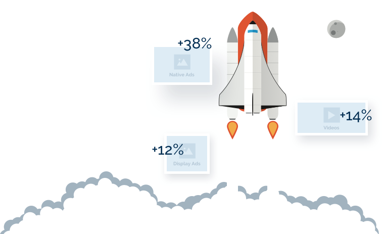
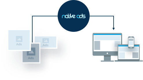
Our demand-side platform makes it simple to launch strategic native, display, video, and retargeting ad campaigns at scale. Choose self-service or have one of our talented marketing experts handle everything for you with our managed option.
Join the Native Ads DSP
Platform Today!